
Data visualisation accessibility
Accessible charts and infographics for reports, websites, presentations and PDFs
Accessible charts and infographics carry their numbers in a form everyone can reach: a short alt text, a long description, a real data table, labels printed on the chart, colours that pass contrast and a second cue besides colour. I make the charts in annual reports, ESG reports, statistics pages, websites, slide decks and PDFs accessible to WCAG 2.2 Level AA, as accessible SVG on the web and as tagged figures in PDF. Every job comes back with measurements and a plain list of what the checkers cannot judge.
In short
What I do
- Write the short alt text and the long description for each chart, with the numbers taken from your data, not read off the picture.
- Build the data table behind each chart (caption, column and row headers) and a CSV download.
- Redraw static charts as accessible SVG: title and description, direct labels instead of a legend, patterns or line weights besides colour, non-text contrast of at least 3:1, layouts that reflow at 320 px.
- Rebuild infographics whose numbers are baked into an image as live text.
- Make the charts survive the trip into PDF: Figure tags with alt text, tagged tables, PDF/UA-1 check.
Not part of this service
- Configuring chart libraries and BI tools. Highcharts, Chart.js, D3, Power BI and Tableau have their own accessibility modules; the worked example does not cover them. I handle exported and static charts and hand-built SVG; library-specific work is quoted case by case.
- Changing what your data says. I do not edit figures, choose different periods or rewrite your analysis. Chart wording you approve.
- Charts inside Word and PowerPoint files. Covered on the accessible Word and PowerPoint page.
- Testing with screen-reader users. My findings come from the files, the standards and the checkers.
- Legal advice. Whether a law applies to your report is for your lawyer or compliance officer.
Is this page for you?
This page is for you if one of these describes your situation:
- You publish an annual report, sustainability or ESG report as a web page or PDF, and its charts are pictures with no text behind them.
- You work for a public body or statistics office, and an accessibility audit flagged your charts: missing alt text, colour-only legends, contrast.
- You are an agency or designer delivering report layouts, and the client’s tender asks for WCAG 2.2 AA or EN 301 549.
- Your PDF fails PDF/UA checks on figures, and you do not know whether the problem is the chart, the layout or the export.
- Your infographics are single images: the key numbers cannot be selected, translated or read aloud.
Check one of your charts in one minute
- Select the numbers. Try to select a value or axis label, on the web page or in the PDF. If you cannot, the numbers exist only as pixels.
- Print it in black and white. If two series or two bars can only be told apart by colour, the chart fails WCAG 1.4.1 (Use of Color).
- Narrow the window to phone width. If the page scrolls sideways or the chart text shrinks to a grey blur, it fails reflow or simply cannot be read.
- Look for the table. No data table or download with the same numbers means a screen-reader user gets one sentence at best.
Read on for the technical detail. Below: what makes a chart accessible, a measured before-and-after example on real NASA temperature data with every file downloadable, what Chromium does to charts when it prints a PDF, and the rules in the EU and the US. To skip ahead, send one report and I will tell you what is wrong with its charts.
What makes a chart or infographic accessible
An accessible chart gives the same information to someone who cannot see it, tell its colours apart or zoom into it: as text, as a table and as a picture that does not rely on colour alone.
Short alt text, long description, data table
A chart is a complex image. Its alt text says what kind of chart it is and its main message in one sentence; a long description next to it gives the trend, the extremes and the key values; a data table gives every value (W3C WAI tutorial on complex images). No alt text can carry 146 data points.
Not by colour alone
A legend that says “green = annual, red = 10-year mean” fails anyone who cannot tell that green from that red. WCAG 1.4.1 requires a second cue: labels printed next to the line or bar, different line weights, dots, hatching.
Non-text contrast and readable text
Lines, bars and the parts of a chart needed to understand it must reach 3:1 against their background (WCAG 1.4.11). Chart text is text and needs 4.5:1 (WCAG 1.4.3).
Reflow and size
At 320 CSS pixels wide, content must work without horizontal scrolling (WCAG 1.4.10). A chart exported as a 960-pixel image either forces sideways scrolling or shrinks until its labels are unreadable. An SVG chart can be laid out again for a narrow screen.
Evidence: a climate report page, before and after
This is a measured worked example on real public-domain data, not client work. I built a deliberately typical “before” report page with three charts, rebuilt them accessibly, printed both to PDF and measured both with the same scripts. The “Climate report 2025” wrapper is an example layout, not a real publication.
Source and license
- Data: NASA GISS Surface Temperature Analysis (GISTEMP v4), Global Land-Ocean Temperature Index, annual mean anomaly in °C relative to the 1951–1980 average. 146 years, 1880–2025.
- Retrieved: 6 October 2026 via the datasets/global-temp data package (
annual.csv, branch main, rowsSource = GISTEMPonly), SHA-256c9f98d4d…628c296e20. - License: GISTEMP is a US Government work in the public domain; the data package repackaging is CC BY 4.0. Derived values: a 10-year trailing mean (1889–2025) and 15 decade means (the 2020s cover 2020–2025, six years).
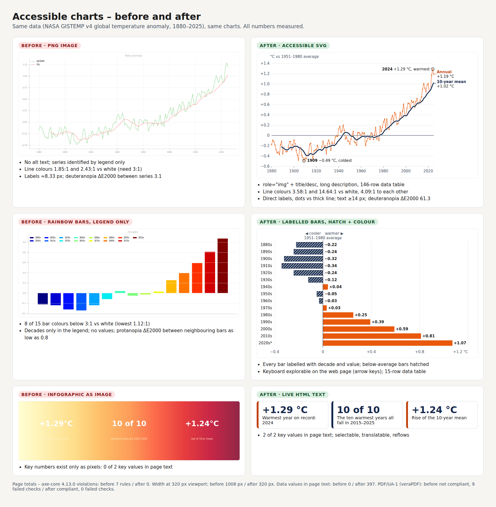
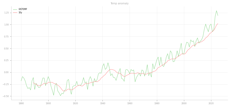
The “before” state: matplotlib PNG charts in an HTML page, printed to PDF by headless Chromium with tagging on, so the failures come from the content. A light green and light red line chart identified only by a legend, rainbow decade bars with the decades only in the legend, and an “infographic” whose key numbers are part of a gradient image. No alt text, a fixed 960-pixel layout, no page title, no language.
What was wrong, measured
| Measured | Before | After |
|---|---|---|
| axe-core 4.13.0 violations at 1280 px (rules / elements) | 7 / 13 | 0 / 0 |
| axe-core violations at 320 px (rules) | 7 | 0 |
| Page width at a 320 px viewport | 1008 px (sideways scrolling) | 320 px |
| Smallest chart text, as rendered | 7.64 px (legend), 8.33 px (ticks) | 15 px at 1280, 14 px at 320 |
| Charts with an accessible name | 0 of 3 | 2 of 2, plus 15 named bars |
| Annual values available as text | 0 of 146 | 146 of 146 |
| Decade values available as text | 0 of 15 | 15 of 15 |
| Infographic key values in page text | 0 of 2 | 2 of 2 |
| Bar chart by keyboard | not operable | one Tab stop; arrow keys, Home and End move between bars |
| Measured | Before | After |
|---|---|---|
| Line series against white (3:1 needed) | 1.85:1 and 2.43:1 | 3.58:1 and 14.64:1 |
| Line series against each other | 1.31:1 | 4.09:1 |
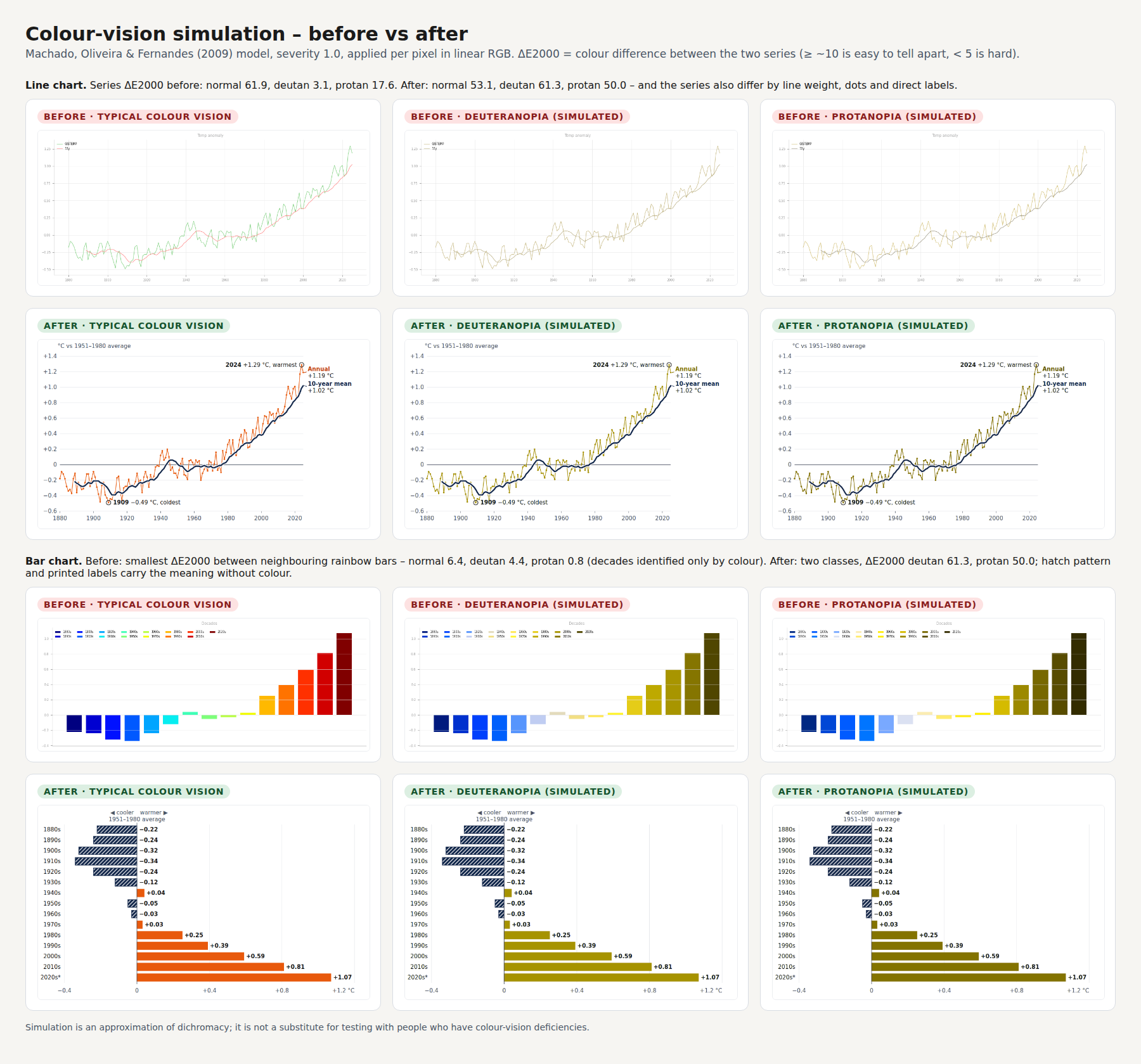
| Line series ΔE2000, simulated deuteranopia | 3.1 | 61.3 |
| Bar colours below 3:1 against white | 8 of 15 (lowest 1.12:1) | 0 of 2 (lowest 3.58:1) |
| Smallest ΔE2000 between neighbouring bars, simulated protanopia | 0.8 | 50.0, plus hatching |
| Chart text (axis, title, caption) | 2.85:1, 2.32:1, 1.92:1 | labels at least 5.18:1, muted text 7.56:1 |
What I changed
Both charts are now hand-built SVG in three width variants (260, 600 and 880 px), chosen by CSS container queries, so chart text never shrinks below its design size. The line chart has role="img" with a title and description: annual values as a thin orange line with dots, the 10-year mean as a thick navy line, both labelled at their ends; the warmest (2024, +1.29 °C) and coldest year (1909, −0.49 °C) are annotated.
The bar chart is horizontal, every bar labelled with decade and value, below-average bars hatched navy, above-average solid orange; on the web page it is keyboard-explorable. Each chart has a visible long description with numbers generated from the data and an expandable data table (146 and 15 rows). The infographic became three stat cards in live HTML text.
What the PDF validator reports
The “after” PDF passes the veraPDF PDF/UA-1 profile with 0 failed checks; the “before” PDF fails 9. Chromium wrote both with tagging on; for the “after” file I also added the metadata PDF/UA asks for and marked untagged decoration as artifacts, which changed 0 bytes of the rendered pixels.
| Measured | Before | After |
|---|---|---|
| veraPDF PDF/UA-1 | not compliant, 9 failed checks | compliant, 0 failed checks |
| Figure tags with alt text | 0 of 3 | 2 of 2 |
| Tables | none (data only as pixels) | 2 tables, 163 rows, 168 header cells (7 column, 161 row), 337 data cells |
| Pages | 1 | 9 (the full 146-row table is included) |
The 9 failures before: three figures without alt text (7.3-1), two pieces of untagged content (7.1-3), no PDF/UA identifier (5-1), no document title in the metadata (7.1-9) and a link without a description (7.18.1-2, 7.18.5-2). The Nu Html Checker found no HTML or ARIA errors in the “after” page; its 4 CSS errors come only from not knowing container queries.
What Chromium does to charts in a PDF
A chart that works on the web page can lose its alt text or its whole tag on the way into PDF. What I observed in Chromium 141 in this run:
The caption becomes the alt text
An HTML <figure> becomes a PDF Figure whose alt text is the figcaption, hiding the chart’s own alt text and nesting the data table inside. The “after” page uses a section with a heading instead.
A chart that disappears from the tags
An <svg role="img"> containing aria-hidden elements produced no Figure tag at all. The print step removes those attributes; inside the SVG they are already hidden by role="img".
Empty cells lose their tag
An empty table cell produced no TD tag, which failed PDF/UA rule 7.2-43 (unequal row lengths). Writing “n/a” in the nine years without a 10-year mean, explained in the caption, fixed it.
Minus signs in tables
Tables and aria-labels use the plain hyphen-minus, which screen readers handle more reliably; the typographic minus (U+2212) appears only in visual labels.
What the checks do not report
Whether the description is right
axe-core and veraPDF check that alt text and descriptions exist, not that they are accurate or well written. The numbers were generated from the data; the wording is mine.
Reading order and tag logic
veraPDF tests the machine-checkable PDF/UA-1 rules only. Reading order, the logic of the tag tree and alt quality need a manual review against the Matterhorn Protocol.
Patterns and real eyes
Contrast between series is measured on flat colours; the hatch pattern and anti-aliasing are not. Colour-vision simulation (Machado 2009) approximates dichromacy; it is not testing with people.
Zoom and text spacing
Reflow was checked at 320 px in Chromium only. Text spacing (WCAG 1.4.12) and 200 % zoom were not measured separately.
I did no screen-reader testing (NVDA, JAWS, VoiceOver or TalkBack) for this example. Gridlines are deliberately decorative at 1.25:1; the values are carried by labels and tables.
Download the files and compare
| File | What it is | Size |
|---|---|---|
| Worked example (ZIP) | HTML pages, both PDFs, SVG charts, veraPDF reports, measurements, data with provenance note, scripts. HTML, SVG, TXT and JSON files are only in the ZIP. | 1.1 MB |
| PDF, before | Printed report page; PDF/UA-1: 9 failed checks | 91 KB |
| PDF, after | 9 pages, tagged figures and tables; PDF/UA-1: 0 failed checks | 426 KB |
| Line chart, before | The original PNG chart, for comparison | 42 KB |
| Data (CSV) | 146 annual values with the 10-year mean, as used in the charts | 2.4 KB |
What you receive
You receive charts that carry their information as text, as tables and as pictures that work without colour, plus measurements that show it.
- For each chart: a short alt text, a long description and a data table, with the numbers checked against your data.
- Accessible SVG charts for the web, or corrected figures and tables in your layout file, depending on where the report is made.
- A tagged PDF if you publish one, with its PDF/UA-1 result and the reason for any remaining failure.
- A colour note: which chart colours pass 3:1, which pairs collapse under colour-vision simulation, and the smallest fix.
- A findings report, including what the checks cannot see.
How the work runs
You send one real report or chart set first; the price is fixed before any work starts.
- Send one file, ideally with the data behind the charts (Excel or CSV). I tell you what is wrong, including the parts not worth paying to fix.
- You receive a scope and a fixed price for that report or the whole set.
- I do the work. You receive a preview, marked as such, with the measurements, the descriptions for your review and any proposed colour changes.
- Your approval releases the final files, the PDF and the findings report.
Pricing
I price each job after seeing the material. Twenty bar charts from one template can take less time than one dense infographic or a map. You get a fixed price for the set before work starts, with no hourly meter. When the charts come from one template or style sheet, fixing that first is usually cheaper, and I will say so.
Why this matters now
EU public bodies must publish accessible content, the European Accessibility Act now covers many consumer services, and reports carry more charts than ever. What that means for you is a legal question.
- EU public sector: the Web Accessibility Directive (EU) 2016/2102 covers public bodies’ websites, apps and the documents on them; charts in statistics pages and reports are part of that content.
- The standard: EN 301 549 V3.2.1, cited by Implementing Decision (EU) 2021/1339, applies the WCAG 2.1 success criteria to web content (clause 9) and documents (clause 10). I work to WCAG 2.2 AA and report against both when a tender asks.
- EU private sector: the European Accessibility Act, Directive (EU) 2019/882, applies from 28 June 2025 to the products and services it lists.
- Sustainability reporting: the CSRD, Directive (EU) 2022/2464, puts sustainability information into the management report; Directive (EU) 2025/794 postponed later application dates. It governs what is reported, not chart accessibility.
- United States: the ADA Title II rule covers state and local government web content, including PDFs. After the April 2026 extension, the deadlines are 26 April 2027 (50,000 people or more) and 26 April 2028 (smaller entities), at WCAG 2.1 AA.
Legal note: this page covers the technical side. Whether a law applies to your organisation or report is for your legal adviser to confirm.
Frequently asked questions
Isn’t alt text enough for a chart?
Not for a chart with more than a handful of values. The alt text gives the type and the main message in one sentence; the long description and the data table carry the detail. In the worked example, the line chart has 146 values, and all 146 are in a table.
Will you change our chart colours?
Only with your agreement. I measure every series colour against the background and against the other series, simulate colour-vision deficiencies, and propose the smallest change that passes. Often a second cue such as hatching or direct labels lets you keep most of a palette.
Can you work on our Highcharts, Power BI or Tableau charts?
The worked example does not cover chart libraries or BI tools, and each has its own accessibility settings. I handle exported and static charts and hand-built SVG; library-specific work I quote case by case after seeing your setup.
Will the PDF pass PDF/UA?
It depends on the tool that writes the PDF, and I tell you per file. In the worked example, the Chromium-printed PDF passed the veraPDF PDF/UA-1 profile with 0 failed checks after the fixes described above. Machine checks cover only part of PDF/UA; reading order and alt quality need human review.
What do you need from us?
The report or page, and if possible the data behind each chart as Excel or CSV. Without the data, I take the values from the chart and you confirm them before anything is published.
Do you test with a screen reader?
No, and I do not claim otherwise. My findings come from the files, the standards and the checkers. Testing by people who use assistive technology should be commissioned separately.
Related services
Send me one report
One file — the report, statistics page or infographic that worries you most, with its data if you have it. You get back a straight account of what is wrong with its charts, including the parts that are not worth paying to fix.
Ali Karabüyük · Tekirdağ, Türkiye · working remotely with clients worldwide · document and image production since 2004, professional practice since 2008.