
Color accessibility for brands
Accessible color palette: a WCAG contrast audit and extension of your brand colors
An accessible color palette is a set of brand colors with clear rules for which text, button, link, status and focus colors may sit on which background, each pairing measured against WCAG 2.2. I audit your existing brand palette, measure every pairing, and extend it with tonal scales that keep your hues. You get a list of approved pairings, UI states, a dark mode, design tokens and a usage guide. Your logo colors stay; the decision on every change is yours.
In short
What I do
- Measure every foreground/background pairing of your palette against WCAG 1.4.3, 1.4.6 and 1.4.11, as a full contrast matrix.
- Build tonal scales (50–950) from your own hues, and pick the steps for text, buttons, links, status messages and focus rings.
- Define UI states (hover, pressed, focus, disabled), a dark mode, and status messages that do not rely on color alone (1.4.1).
- Deliver design tokens as CSS, W3C DTCG JSON, Tailwind config, Adobe ASE swatches and a Figma variables JSON, plus a usage guide.
Not part of this service
- A new brand identity. I work with your hues. Where a color has to get darker, I show you how far it moves; you decide.
- Implementing the palette in your website or app. I deliver the tokens and the rules; your developers or agency apply them.
- A full accessibility audit of your site. Color is one part of WCAG. Focus order, layout, forms and alt text are separate work.
- Testing with people who have color vision deficiencies. I use a published simulation model, not user testing.
- Legal advice. Whether a law applies to your company is for your lawyer to confirm.
Is this page for you?
This page is for you if one of these describes your situation:
- An accessibility check flags low contrast on your website or online shop, and the failing colors come straight from your brand book.
- You are a brand or design agency, and a client’s tender or EU customer asks for WCAG 2.2 AA. You need a palette that passes without losing the brand.
- Your design system needs tokens for light and dark mode, and nobody has measured which combinations are actually allowed.
- Your error and success messages are red and green text only, and you are not sure everyone can tell them apart.
Check your brand colors in one minute
- Body text: enter your text color and background in the WebAIM Contrast Checker. Below 4.5:1, normal-size text fails WCAG AA.
- Buttons: check the label color on your main button color. White on a bright orange, teal or yellow often lands near 2:1.
- Focus: press Tab on your website. If you cannot see where you are, or the ring is a pale tint, keyboard users cannot either.
- Status: switch your phone to grayscale and open a form with an error. If the error looks like any other text, it relies on color alone.
Read on for the technical detail. Below: which WCAG criteria concern a palette, a measured before-and-after example on a fictional coffee brand with every file downloadable, and the rules in the EU and the US. To skip ahead, send your brand book or color list and I will tell you which pairings fail.
What makes an accessible color palette
A palette is accessible when every combination your brand actually uses meets its WCAG threshold, and when no information depends on color alone. Single colors are never “accessible” on their own; only pairings are.
Text contrast: 1.4.3 and 1.4.6
WCAG 2.2 measures contrast as a ratio between the relative luminance of two colors, from 1:1 to 21:1. Success criterion 1.4.3 (Level AA) asks for 4.5:1 for normal text and 3:1 for large text (about 24 px, or about 18.7 px bold). 1.4.6 (Level AAA) raises this to 7:1 and 4.5:1. AA is the level laws and tenders usually cite; I mark which pairings also reach AAA.
Buttons, input borders and icons: 1.4.11
Non-text contrast, 1.4.11 (AA), asks for 3:1 for the visual parts needed to recognize a control or its state: an input border, a checkbox, the edge of a button that has no text label, a focus ring, the meaningful parts of an icon. A pale grey border on white is the typical failure.
Color alone: 1.4.1
Use of Color, 1.4.1 (Level A), says color must not be the only way to convey information. A red message and a green message that differ only in hue fail, however good their contrast. An icon and a word such as “Error:” fix that; the palette then only has to support them.
Focus rings: 2.4.13, and what 2.4.11 is not
Focus Appearance, 2.4.13 (AAA, new in WCAG 2.2), asks for a focus indicator of sufficient size with 3:1 contrast between focused and unfocused states. A palette can supply the colors and the ring definition; only the implemented page can prove the size. 2.4.11, Focus Not Obscured, is often confused with this: it is about sticky headers and overlays covering the focused element, a layout matter that no palette can solve.
Evidence: a fictional coffee brand, before and after
This is a measured worked example on a fictional brand, not client work. I invented “Örnek Kahve Co.” and its brand-book palette with typical brand-book choices, measured it, rebuilt it, and checked the result with independent tools. Every figure, report and file below is labelled “Fictional example brand”.
Source and tools
- Before palette: white #FFFFFF, cream #FFF8F0, primary orange #F28C28, secondary teal #2EC4B6, accent yellow #FFD166, grey text #A0A0A0, espresso #4A3428, status red #E74C3C and green #2ECC71 (no icons), pale focus ring #CDEFEB.
- Color maths: WCAG 2.x ratio from sRGB relative luminance; tonal scales in OKLCH (coloraide 8.13), hue kept, lightness solved for a fixed contrast target against white.
- Color vision simulation: the matrices of Machado, Oliveira and Fernandes (2009), severity 1.0, applied in linear sRGB.
- APCA: cross-checked against npm
apca-w30.1.9 and reported as information only. APCA is not a WCAG 2.2 requirement. - Typeface in figures and guide: Inter (SIL Open Font License 1.1).
What was wrong, measured
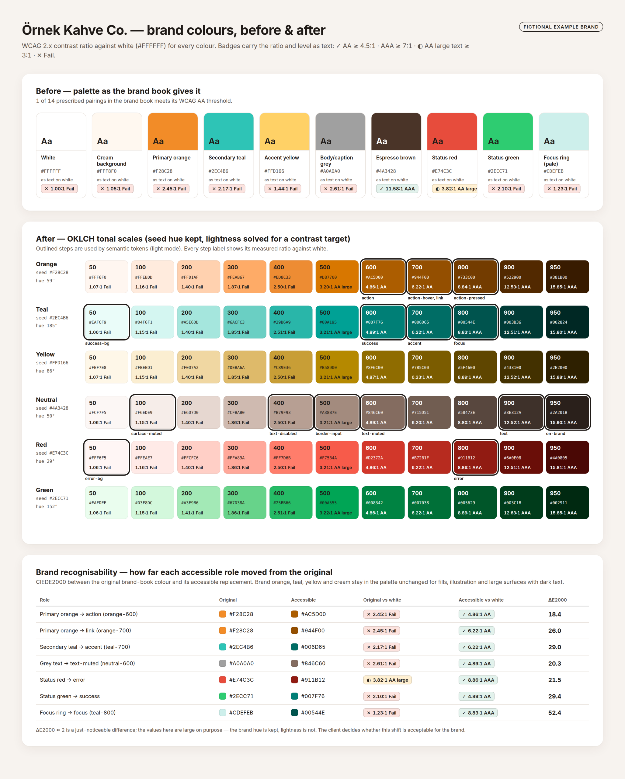
The brand book prescribed 14 uses (body text, button labels, links, messages, focus ring, borders). One of the 14 met its threshold: espresso on yellow, 8.03:1.
| Use in the brand book | Colors | Ratio | Needed |
|---|---|---|---|
| Body and caption text on white | #A0A0A0 on #FFFFFF | 2.61:1 (Lc 51.0) | 4.5:1 |
| Primary button label | #FFFFFF on #F28C28 | 2.45:1 (Lc −52.8) | 4.5:1 |
| Secondary button label | #FFFFFF on #2EC4B6 | 2.17:1 | 4.5:1 |
| Links and prices | #F28C28 on #FFFFFF | 2.45:1 | 4.5:1 |
| White badge on yellow | #FFFFFF on #FFD166 | 1.44:1 | 4.5:1 |
| Error message text | #E74C3C on #FFFFFF | 3.82:1 | 4.5:1 |
| Success message text | #2ECC71 on #FFFFFF | 2.10:1 | 4.5:1 |
| Focus ring against the page | #CDEFEB on #FFFFFF | 1.23:1 | 3:1 |
| Focus ring against the primary button | #CDEFEB on #F28C28 | 2.00:1 | 3:1 |
| Promo banner text | #4A3428 on #FFD166 | 8.03:1 | 4.5:1 |
The remaining four (body text on cream, accent headings, button edge, input border) failed too; all 14 are in the measurements file. In typical vision, the red and green status colors differ strongly (CIEDE2000 72.35). Under simulated deuteranopia that difference drops to 11.64.
What I changed
For each hue I built an 11-step scale in OKLCH and picked the steps that pass for each role. The brand orange, teal, yellow and cream stay unchanged for the logo, illustration and large fills. Text on brand orange or yellow uses a dark neutral (6.48:1 and 11.03:1).
| Role | Original → accessible | Before | After | ΔE2000 |
|---|---|---|---|---|
| Button / call to action | #F28C28 → orange-600 #AC5D00, white label | 2.45:1 | 4.86:1 | 18.4 |
| Link | #F28C28 → orange-700 #944F00 | 2.45:1 | 6.22:1 | 26.0 |
| Accent | #2EC4B6 → teal-700 #006D65 | 2.17:1 | 6.22:1 | 29.0 |
| Secondary text | #A0A0A0 → neutral-600 #846C60 | 2.61:1 | 4.89:1 | 20.3 |
| Error | #E74C3C → red-800 #911B12 | 3.82:1 | 8.86:1 | 21.5 |
| Success | #2ECC71 → teal-600 #007F76 | 2.10:1 | 4.89:1 | 29.4 |
| Focus ring | #CDEFEB → teal-800 #00544E with a 2 px white inner ring | 1.23:1 | 8.83:1 | 52.4 |
The honest part: a CIEDE2000 difference of about 2 is just noticeable. Shifts of 18 to 29 are clearly visible. The hue stays, the lightness does not: the button orange becomes a deeper amber-brown. Whether that is still your brand is a brand decision, and it is yours. In a client job, you see these numbers and swatches before anything is final.
UI states, dark mode and status messages
- Hover and pressed: orange-700 (6.22:1 with white) and orange-800 (8.84:1).
- Focus: a 3 px outer ring in teal-800 plus a 2 px white inner ring. Outer ring against the page 8.83:1, against cream 8.38:1; the white inner ring against the orange button 4.86:1.
- Disabled: label at 2.17:1 (light) and 1.80:1 (dark), reported for information. Inactive components are exempt from 1.4.3.
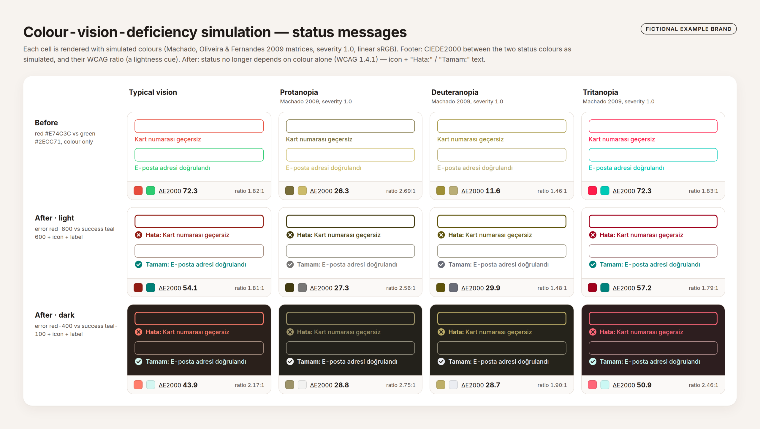
- Status messages: now carry an icon and the words “Hata:” or “Tamam:” (the example brand’s interface is Turkish), so color is no longer the only cue.
- Dark mode: its own set of approved pairings, all re-measured; in dark mode the action color resolves to
#ed8c33.
What the verification reports after
| Measured | Before | After |
|---|---|---|
| Brand-book uses meeting their threshold | 1 of 14 | 14 of 14 (same uses, new roles) |
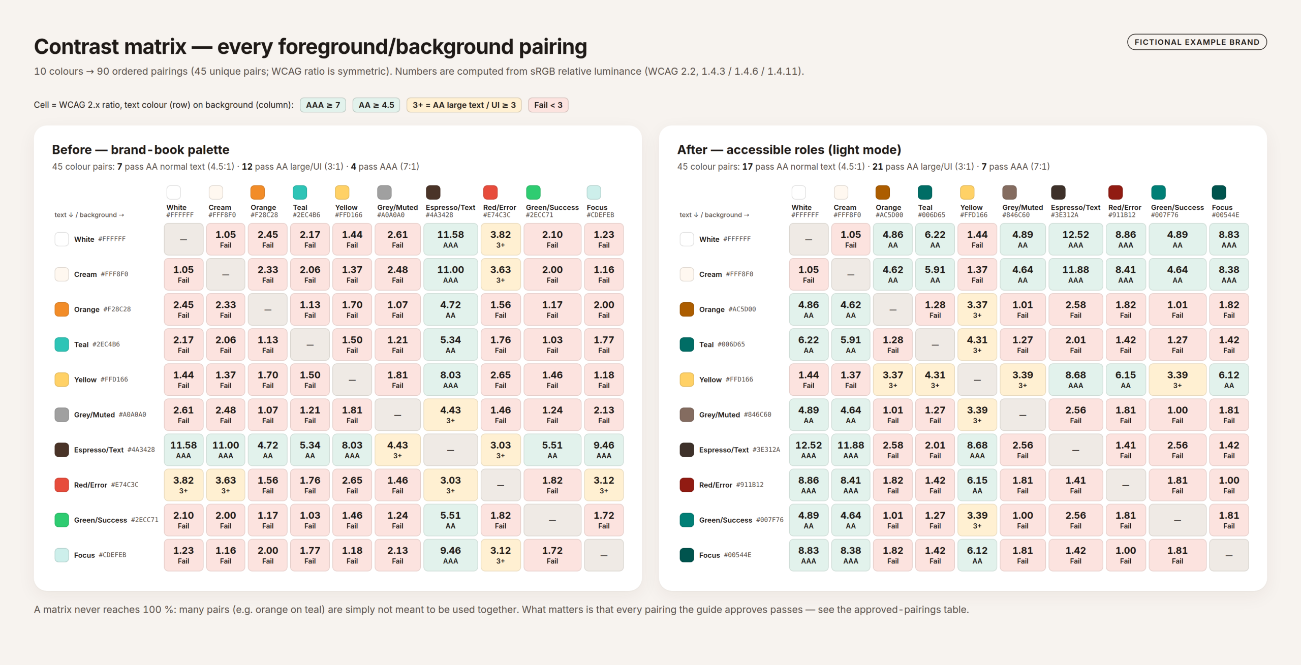
| Full matrix, 45 pairs: AA normal text (4.5:1) | 7 | 17 |
| Full matrix: AA large text / UI (3:1) | 12 | 21 |
| Full matrix: AAA (7:1) | 4 | 7 |
| Approved pairings, light mode (16 text, 11 non-text) | – | 27 of 27 pass; lowest text 4.61:1, lowest UI 3.04:1 |
| Approved pairings, dark mode | – | 27 of 27 pass; lowest text 6.32:1, lowest UI 3.91:1 |
| Text pairings that also reach AAA | – | light 6 of 16, dark 10 of 16 |
For the status colors, the search kept only error and success candidates that reach 4.5:1 on white and cream, then chose the pair with the largest minimum difference across the three simulations.
| Pair | Typical | Protan | Deutan | Tritan |
|---|---|---|---|---|
Before: #E74C3C vs #2ECC71 | 72.35 | 26.32 | 11.64 | 72.28 |
| After, light: red-800 vs teal-600 | 54.13 | 27.28 | 29.92 | 57.20 |
| After, dark: red-400 vs teal-100 | 43.85 | 28.75 | 28.72 | 50.89 |
The gain comes from moving success to a bluish green. The lightness ratio between the two is about the same as before (1.81:1 against 1.82:1), so color remains a secondary cue. The icon and the word carry the meaning.
How the results were cross-checked
Show the ten cross-checks (tool, version, result)
| Check | Result |
|---|---|
| My WCAG ratios vs axe-core 4.13.0 on 180 rendered pairs | largest difference 0.01 (rounding) |
| axe-core 4.13.0 on the usage guide (WCAG 2.0, 2.1, 2.2 A/AA rules) | 0 violations, 0 incomplete, 18 rules passed |
| axe-core 4.13.0 on the before and after matrix pages | 0 violations each |
| APCA values vs npm apca-w3 0.1.9, 205 pairs | identical (difference 1.4 × 10⁻¹⁴) |
| Color vision simulation vs coloraide 8.13, 76 colors × 3 | identical to the 8-bit value |
| DTCG tokens.json | 117 tokens, 0 unresolved aliases; Style Dictionary 5.6.0 builds 117 CSS variables |
| tokens.css in Chromium, light and dark | --color-action resolves to #ac5d00 / #ed8c33 |
| palette.ase | independent parser (swatch 0.4.0) reads 9 groups, 116 swatches |
| figma-variables.json | 94 variables, 117 mode values, 0 dangling aliases |
| tailwind.config.js | loads in Node 22 |
What the checks do not report
Thin, small type
The WCAG ratio ignores font weight, size and anti-aliasing. A thin 12 px label can pass 4.5:1 and still be hard to read. APCA addresses part of this, but it is not a WCAG 2.2 requirement, so I report it for information.
Real eyes and screens
The simulation models full dichromacy with one 2009 method. Anomalous trichromacy, low vision and real displays vary. No user testing was done for this example.
Import into Figma and Adobe
The Figma payload and the ASE file were validated for structure only, not imported into Figma or an Adobe app. Figma’s variables REST endpoint is limited to Enterprise plans.
Your real product
axe-core checks the rendered contrast of the guide. It cannot tell whether your product uses color alone somewhere, or whether a sticky header hides the focus ring (2.4.11).
And a number is not a brand decision. ΔE2000 tells you how far a color moved; whether it still feels like your brand is for you to judge.
Download the files and compare
| File | What it is | Size |
|---|---|---|
| Worked example (ZIP) | All files below plus the token files (tokens.json, tokens.css, tailwind.config.js, palette.ase, figma-variables.json), the HTML contrast matrices, the HTML usage guide, measurements.json, findings and the scripts. These file types are available only inside the ZIP. | 2.8 MB |
| Usage guide (PDF) | Two A4 pages: brand colors, working tokens, rules, UI states, approved pairings, dark mode, limits | 177 KB |
| Approved pairings (CSV) | 27 light and 27 dark pairings with ratios | 4.6 KB |
| Contrast matrix, before (CSV) | 90 ordered pairings of the brand-book palette | 6.4 KB |
| Contrast matrix, after (CSV) | 90 ordered pairings of the accessible roles | 6.6 KB |
What you receive
You receive a measured palette, the rules for using it, and the same palette as files your designers and developers can load.
- A contrast matrix of your current palette (before) and of the extended one (after), as HTML and CSV.
- Tonal scales built from your hues, with the measured ratio of every step.
- A list of approved pairings for light and, if you need it, dark mode, with UI states and focus ring.
- Design tokens: CSS custom properties, W3C DTCG JSON, Tailwind config, Adobe ASE swatches, Figma variables JSON.
- A usage guide as HTML and PDF, and a findings report that lists every color shift (ΔE2000) and what the checks cannot see.
How the work runs
You send your brand colors first; the price is fixed before any work starts.
- Send your brand book or color list. A PDF of the brand guidelines, your CSS, or a screenshot of the key screens is enough. I tell you which pairings fail and by how much.
- You receive a scope and a fixed price, including the modes and token formats you need.
- I do the work. You receive a preview of the palette and guide, marked as such, with the contrast report and every proposed color shift for your approval.
- Your approval releases the final files: tokens, guide, matrices and findings report.
Pricing
I price each job after seeing the material. Effort depends on the number of colors and roles, whether you need a dark mode, and which token formats your tools use; an existing design system with named tokens is quicker than a brand book with loose hex codes. You get a fixed price before work starts, with no hourly meter.
Why this matters now
Low-contrast text is the failure found most often in WebAIM’s yearly scan of one million home pages, and since 28 June 2025 the European Accessibility Act makes WCAG-level accessibility a legal matter for many consumer-facing websites and online shops in the EU. What that means for your company is a legal question; this page covers the technical side.
Legal note: this page covers the technical side. Whether a law applies to your company is for your legal adviser to confirm.
- EU private sector: the European Accessibility Act, Directive (EU) 2019/882, applies from 28 June 2025 to the products and services it lists, including e-commerce. Microenterprises providing services are exempt.
- The standard: EN 301 549 V3.2.1, cited by Implementing Decision (EU) 2021/1339, applies the WCAG 2.1 success criteria, including 1.4.1, 1.4.3 and 1.4.11. I work to WCAG 2.2, which contains all of them.
- EU public sector: the Web Accessibility Directive (EU) 2016/2102 covers public bodies’ websites and apps, against the same standard.
- United States: the ADA Title II rule covers state and local government web content at WCAG 2.1 AA. After the April 2026 extension, the deadlines are 26 April 2027 (50,000 people or more) and 26 April 2028 (smaller entities).
A palette fixed at the token level fixes every page that uses it. That is usually cheaper than correcting contrast one page at a time.
Frequently asked questions
Will our brand colors change?
Your logo and brand colors stay for logo, illustration and large fills. Text, link, button and status roles get darker steps of the same hue, and those shifts are clearly visible (CIEDE2000 18 to 29 in the example). You see every shift before approving, and the brand decision is yours.
Why doesn’t every color combination pass afterwards?
Because it does not need to. In the example, 17 of 45 pairs pass AA text after the rework; the rest are combinations nobody should use for text. The approved-pairings list, 27 of 27 passing in light and dark mode, is what your team works from.
What about APCA and WCAG 3?
I calculate APCA values and include them for information, because they say more about thin and small type. WCAG 2.2 uses the contrast ratio, and that is what laws and tenders cite today. The palette is built to pass WCAG 2.x.
Can we import the tokens into Figma, Adobe and our code?
The files follow the published formats, and in the example their structure was checked with independent tools: Style Dictionary builds the CSS, an independent parser reads the ASE, and the Figma file is a variables REST API payload. They were not imported into Figma or an Adobe app, and Figma’s variables API needs an Enterprise plan. I tell you what to expect for your tool before you approve.
Does the color-blindness simulation mean the palette works for everyone?
No. It is a published model of full dichromacy, not a test with people. That is why status messages get an icon and a word: then the meaning no longer depends on telling two colors apart.
Does an accessible palette make our website accessible?
It removes one common class of failures, if the tokens are applied as specified. Focus order, a focus ring hidden by a sticky header, forms, alt text and keyboard use are separate topics. An accessibility audit of the implemented site is separate work.
Related services
Send me your brand colors
A brand book, a list of hex codes, or a screenshot of your main page. You get back a straight account of which pairings fail, by how much, and how far each color would have to move.
Ali Karabüyük · Tekirdağ, Türkiye · working remotely with clients worldwide · document and image production since 2004, professional practice since 2008.